Animation for MP Stacks!

We just released a really exciting new Add-On plugin for MP Stacks (our page-building WordPress plugin) which allows you to animate almost anything on the page! You can separately animate both content-types, no matter what that Content-Type it is. It could be text, a video, a contact form, or even a PostGrid – you can make it animate-in in any way you can imagine.

Because it uses Keyframes, there is virtually no limit to the ways you can animate content in and out. Check it out here if you’d like to spruce up your MP Stacks with some custom animations.

Added “Works” page to Launchstack Theme Bundle

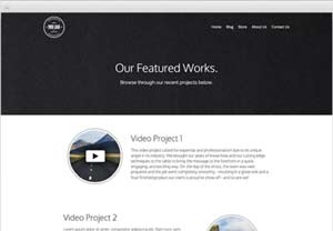
We just pushed out version 1.0.0.3 of the Launchstack Theme Bundle which now includes a “Works” page – perfect for showcasing any recent project you/yourcompany have completed. It’s great for video professionals wanting to showcase their work in a classy/unique way. Check out the new layout here:

works-page


In order to get that nice “Play” button overlay on the video thumbnails, check out this article:
How to make Launchstack Video Buttons


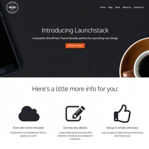
Want to checkout the Launchstack Theme Bundle? Click here!

Isotopes for WordPress

Isotope JS + WordPress

Integrating Isotope JS with WordPress has
never been easier or better than this.

No Coding. Use Any Theme. Setup in Minutes.
Free and Fast Support Email: support@mintplugins.com

PostGrid WordPress Plugin

The free "PostGrid" WordPress Plugin displays WordPress "Posts" and features Isotope Filtering without any extra coding. It also gives you the ability to set your number of posts-per-row, all colors and text sizes, infinite scrolling, and much more! It works with any theme and is a great way to create your "Blog" page in WordPress. Show a grid of posts on your site today!

Enter your email to download the "PostGrid" WordPress Plugin (Free Forever).

WooGrid WordPress Plugin

Create a WooCommerce product grid in minutes with complete Isotope filtering control. Give your customers a quick and easy way to sift through your products and buy them! You can put this grid anywhere - from your homepage, to custom pages - or even embed it in a blog post! WooGrid is a great way to increase sales with your WooCommerce store.

Tip for Productivity

When you work for yourself, it can be hard to force yourself to stay on task and stay as productive as you’d like to be. One thing I’ve found to be really useful in keeping me focused is my to-do list.

updogI often get distracted by new and shiny things – much like the dog from “UP”…SQUIRREL! I believe that if I were born today I’d be on ritalin for sure (thank goodness I dodged that bullet!). Without going too far off topic, I really view this attention-deficit-type way of thinking as a positive thing – if I can harness it properly.

But unharnessed, I often find that while I’m waiting for a page to load, file to backup, or program to open (which can be fractions of a second), I’ve already wandered off to Twitter or Facebook to “kill time” while I’m waiting. By the time the page loads, I can find it hard to remember exactly what I was working on when I started, and I end up losing 5 minutes instead of just the 10 seconds it took to load a page.

Bring in the To-Do list! My to-do list gives me something to glance at, remind myself what I am working on, and re-focus quickly. I use this technique hundreds of times per day so it has to be quick in order to be effective.

Separate To-Do Lists:

As I touched on before, I have a mind that likes to wander and can be very imaginative – which is a double-edged sword. It gives me tons of inspiration to work on for new ideas and code inventions but I can also and up wasting a lot of time just sitting and thinking. One way I’ve found to take advantage of these thoughts, but not let them kill my productivity on current projects, is to create a SEPARATE to-do list for the long term and the short term.

I call the long term one my “Long Term To-Do List” (creative, I know). This is for ideas I know will take a lot of time and need to be thought out more clearly before starting them.

My short term list is called my “Immediate To Do” list and it gets updated dozens of times per day as I accomplish different micro tasks.

This way, I have a place to put my “Big Idea” thoughts AND a place to put the things I really need to accomplish TODAY.

I have been using Evernote for my To-Do lists lately – which is great because it syncs to my iPhone – which allows me to be anywhere when I come up with a “Big Idea” and write it on my iPhone quickly – and when I get back to my desk I can re-format the text more clearly and have it ready when I need it. Evernote also sits conveniently in my dock at the bottom of my screen so I can “flip” to it hundreds of times per day to help me re-focus after getting distracted.

Having a place to put my tasks and ideas has really helped me to be more productive, capitalize on many ideas, and even sleep better at night!

I hope these little tips can help you to stay productive as well – especially if you have a mind that wanders like I do.

Thoughts on web content width.

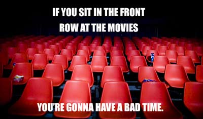
I remember going to see “The Matrix” right when it came out. It was directly after my high school graduating ceremony and so we were running late. We finished up our graduation and raced over to the movie theatre. Unfortunately, you know what happens if you try to go to a movie late – you’re stuck in the very front row, off to the side, craning your neck from side to side of the screen just to see everything. It was pretty overwhelming and a bit nauseating – and I told myself that I would never come to a movie late again.

front-row-sucks-moviesWhat does this have to do with the content width on your website? Well, I have been seeing a trend in some websites where the content (text and images mainly) is wider than 1200 pixels in desktop view (we’re not talking about mobile phones here) – so wide, in fact, it touches all edges of the screen. I suspect this is because designers often have very large screens and so they design to make it look good on those screens – and let “responsive”-ness fix it up for any smaller screens.

Unfortunately, on my MacBookPro 15″, it means that the title of a section is scrolled out-of-view while I’m reading it’s subtext. This makes it very difficult for me to keep what I am looking at in context and I start to feel lost on the page – the same feeling I got at the movie theatre sitting in the very front row and off to the side.

Section titles are our “bearings” when we are reading a page – and as often as we can, it helps to keep those bearings in-view. Basically, a section of your page, (or “Brick” as we like to call it) should be able to entirely fit on an average laptop screen from top to bottom. (This is also one of the drawbacks of “responsive” web design – but that’s a topic for another blog).

By making our content extremely wide and large, it feels a little bit like going to the movies and sitting right in the front row. When you are designing your pages (maybe you’re using our free page building plugin “MP Stacks” to do so), make sure to test it on all screen sizes – and try to keep your page sections small enough that you don’t make your users feel like they are at the front row of the movie theatre.

Multiple Widgetized Areas Per Page

We just pushed out version 1.0.0.4 of the free Widgets Add-On for our MP Stacks plugin (also free).

This release addresses a bug which prevented you from having multiple widgetized bricks per page. Now you can have as many widgetized bricks as you need – so get as crazy as you need to with widgets!

Note: If you already have some widgetized bricks, just open the Brick Editor for that brick (by double clicking anywhere on the brick). This will “refresh” the brick and make your widgets appear again.

If you have any feedback to give or feature requests, make sure to let us know!

Check out the MP Stacks + Widgets Addon here.

Offline Meets eCommerce?

We do a lot of work here at Mint Plugins to make eCommerce solutions for WordPress seamless and easy to use. But yesterday I was talking to an artist who is selling offline (face to face) using Square to sell their painting at Art Shows around their city. I was absolutely blown away at how great the process is using Square (note this isn’t a sponsored post).

They have considered everything from invoicing customers through email/text, to invoicing customers if they pay you in cash – which helps to keep your books and everything in one place.

If you sell products offline (in person), Square is an amazing option that allows you to swipe people’s credit cards using your Smart Phone. It doesn’t have a monthly fee – they just take a small cut of each purchase – like ANY credit card processor does.

If you sell on your website, unfortunately, Square doesn’t have an API at this point that we can use to truly keep all of our books and invoices in-sync across all platforms. I’m really hoping they open an API at some point though because it is super super slick. Check it out if you’re selling anything offline!

Changing your scenery is key!

If you’re anything like me, you spend a lot of time at your desk quietly working away and you’re pretty happy doing it. I wouldn’t say I’m an introvert. I’m more of a half-and-half type of person. I like to be outgoing and meet new people – but when I’m working, I’d rather just be left alone in my own little hole to get stuff done and tinker away on my next invention.

But come February you might find yourself experiencing a case of the blah’s and find yourself doing more fidgeting than figuring-out stuff. So how do I go about staying on task to make sure I get stuff done?

Change up your scenery. What do I mean by this? Well, while your desk and your chair are pretty awesome, and they’ll always be your go-to place, sometimes changing it up a bit is all it takes to help you settle back into a work-flow.

I know a lot of people are starting to use standing-desks, which is great, BUT you’re still chained to your desk (if its one of those desks that raises up and down). Also, be careful not to stand for too long (read more about that here).

What I’m talking about is something a little different. Take a few hours and set up standing at your kitchen counter

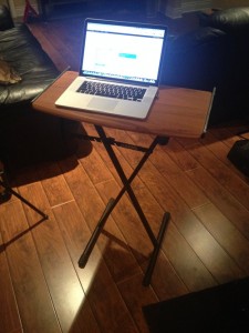
My piano-stand, portable desk.

My piano-stand, portable desk.

(when nobody’s using it of course…food, drinks, and laptops don’t mix very well). Or maybe set up on the couch for an hour until you feel ready to get back to your desk. I like to make workstations out of anything I have around at the time. It could be a stack of boxes beside a big window, or a piano stand with a board on top that I can move anywhere in my house!

After a few hours of a changed up environment, my brain is working better, my posture improves, and my work is getting done. Bottom line: Changing up my workspace constantly has improved my workflow – and maybe it can for you too! Give it a try.

“The Grid(io)” VS WordPress

There’s a new kid on the web-design block calling itself “The Grid(io)” – and it has a lot of hype. It promises to build your website for you using “Artificial Intelligence” and “Robots” – and that it will save you hours of time by not needing to worry about the nitty-gritty parts of your website. If you’d like to see the advertisement in question, it’s here.

Basically, their advertising makes it seem like you just put all of your content on a USB stick, throw it at a computer, and out will come a beautiful website – which will be everything you ever dreamed of and more! Literally, the sell line is: “Wouldn’t it be better if websites just made themselves?”.

Is this possible? Maybe. But it brings to mind something Dad used to tell me:

“Son, if it seems too good to be true, it probably is” – My Dad

Lets take a step back for a moment and look at this for what it really is – an advertisement. It’s an advertisement that simultaneously attacks services like Squarespace and WordPress (for being template-based) while presenting itself as a sort of “Second Coming” of web design.

Its cleverly worded verbiage almost convinced me that things I formally thought were downfalls of a WordPress theme – are actually somehow bonuses with “The Grid”:

These are “The Grid”‘s main selling points:

  • You can’t put things where you want them. Robots do it.
  • You can’t choose your own font. Robots do it.
  • You can’t choose the size/placement of your images. Robots do it.
  • And so on. You can’t choose display option “X”. Robots will choose that for you now.

Now, call me crazy, but those aren’t the selling points (or the robots/droids) I’m looking for.

not-the-selling-points

Is “The Grid” all that different from WordPress?

Even with WordPress (Or even Squarespace, Wix, or “The Grid“), another thing to consider is that most of the time spent working on your website isn’t coding or messing with layouts. No matter your website’s foundation, most of the time is spent creating content.

Most “website time” is spent doing things like:

  • Getting great Photography (by taking it or finding/buying Stock Photos)
  • Creating an awesome Promo Video
  • Writing great blogs and text content
  • Posting your latest product to your store
  • Keeping your website’s event calendar up to date

Don’t let the advertisement fool you: this stuff takes time. I can guarantee “The Grid” will not do that stuff for you – nor will it be faster than WordPress or any other system. But according to the ad, it feels like that stuff will do itself too. If it was truly as easy as they make it sound, it would. After all, “Website’s should make themselves” right? Wrong. People make content – and websites ARE content. All of the “robots” in the world won’t make you good and unique content. It’s what separates humans from robots (at least for now).

Truth be told, “The Grid” doesn’t seem all that different from a pre-designed WordPress Theme (other than the fact that you have more control over your WordPress theme – especially if it uses MP Stacks – or, heck, even some of the other great Page Building Plugins for WordPress out there).

If there’s one main thing I’ve learned about people building websites in my over 10 years of doing web design, making themes, and developing plugins, it’s that people WANT control over their website. They want to be able to move their things around as they see fit – not a robot making those choices for them. At the beginning of WordPress Themes, themes were intended to be what The Grid is: something you never have to “mess with”, that looks great, and can accept your content: and they generally still are exactly that. But even with Themes, people want more control. They want to be able to do stuff like use a font of their own choosing. With “The Grid”, Robots do that for you now.

Basically, it seems like you’ll be paying a lot of money to have LESS control over your site and get a design/layout that you may or may not love – and have no control over making it your own – other than asking “the robots” for something new and hoping they spit out perfection.

I’m not trying to bash a new idea. This really could be the best thing since sliced bread. Maybe it isn’t too good to be true. But it never hurts to take a step back and realize you are watching an advertisement tooting its own horn. I still strongly believe that WordPress is the best website solution out there. It has years of testing behind it, a HUGE, talented, passionate, and committed community, and is constantly being upgraded – literally daily. It isn’t a flash in the pan and it won’t be gone tomorrow with your cash in its pocket.

My desire with this blog post is just to shine a realistic light on some extremely cleverly worded (and a bit  over-the-top) advertising before everybody throws their websites off a cliff without looking first.

Knapstack Theme updates are now totally free!

We are kicking the new year off right – by giving away our Knapstack Theme! The new update (version 1.0.7.0) changes the Knapstack theme to now include free updates. Initially we were charging $5/year for updates to the theme but realized most people were just leaving their theme un-updated – which isn’t good for anybody. So to help keep the wheels greased and the machine ticking along the way it should, we are giving away both the Knapstack Theme – and all future Knapstack Theme updates for free.

Knapstack Theme


Another major upgrade is the sidebars. There are now 3 different sidebar areas in the Knapstack Theme:

  • The Category Sidebar (displays to the right of any category archive)
  • The Post Sidebar (displays to the right of any post)
  • The Page Sidebar (display to the right of any page using the 600px wide page template)
The new sidebars in the Knapstack Theme can be found on the "Appearance" > "Widgets" page in your WP dashboard.

The new sidebars in the Knapstack Theme can be found on the “Appearance” > “Widgets” page in your WP dashboard.

One of the coolest things about sidebars is that the newest version of MP Stacks (our free Page Building Plugin for WordPress) allows you to use a Stack in a sidebar using the “Stack” widget under “Appearance” > “Widgets”.

This means that all the power and flexibility of MP Stacks can be used on JUST the sidebar! This expands the power of sidebars hugely – allowing you to have your own backgrounds, content-types, grids, and even Add-ons like Parallax.

So to sum it all up, you never need to worry about paying for updates to the Knapstack Theme ever again! They are on the house – courtesy of us here at Mint Plugins.

MP Stacks Updated to 1.0.1.3

We just released a big update for the MP Stacks Page-Building plugin. One of the best new features in Version 1.0.1.3 is the auto sizing of large text for small screens. Prior to this release, if you made a Text Content-Type in a Brick with a large font size, the words would get cut off on mobile screens.

Now, MP Stacks will automatically figure out the maximum size the text can be based on the longest word in your text area so that it fits perfectly on the Mobile screen without being cut-off or split up in any way.

This is all part of our philosophy to make it easy and fun for you to make fonts in a brick exactly how you’d like them on large screens, without needing to be bothered with options for smaller screens – but handling it perfectly all by itself. It’s small things like that that are often overlooked in mobile layouts – and is now one that MP Stacks handles perfectly. The update is available completely for free. Enjoy!

Canadian Thanksgiving Support Notice

Greetings! It’s Canadian Thanksgiving this weekend so our support will be back on Tuesday Oct 14. Thanks for your patience eh!

Stay tuned for great updates coming for the PostGrid add-on too!

Are you a Developer & new to Git? This is an awesome read!

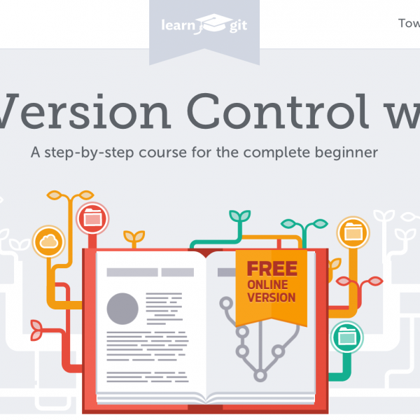
Are you a developer who is just getting started with using Git? Perhaps you’re feeling kind of lost and don’t know where to start. It can feel like trying to fly an airplane in the dark with forks in your eyes. If that’s you, don’t give up! Keep going – and here’s a really awesome and free e-book from the makers of Tower – which is also a great way to manage Git Projects if you use a mac and don’t feel super comfortable with using the Command Line.

Check it out! http://www.git-tower.com/learn/ebook/mac

A way to save money at Trade Shows

I was recently doing some work for a client who wanted to show their website at a Trade Show – but the Trade Show was only providing internet for $1500 per booth for 2 days!!! To us it was too crazy to pay that much – and so instead, we built a local version of their websites on their laptop so they could properly show the site off – without needing internet. We did this without even needing to change the domain name – by simply temporarily telling their computer to point to a local directory on their hardrives when visiting that URL.

A bulk of this I got from this post here:
http://sawmac.com/mamp/virtual/

The general idea was to set up a MAMP on their laptops, create a virtual host file for the site, and then modify their hosts file to point the domain at their local IP (127.0.0.1) instead of at their website.

Just something to consider if you’re in the same boat! All of the info you need is in that post above to set this up 🙂

Image Used: “IBM CeBIT 2010” by Patrick from Garbsen, Germany – IBM. Licensed under Creative Commons Attribution 2.0 via Wikimedia Commons – http://commons.wikimedia.org/wiki/File:IBM_CeBIT_2010.jpg#mediaviewer/File:IBM_CeBIT_2010.jpg


Important update to the Knapstack Theme

Hey everybody! WordPress 4.0 just dropped and it’s time to update your installs. This also means that many of your plugins and/or themes may also need updates. As grueling as that can be sometimes (and scary), it’s an important thing to not let yourself fall behind in updates because security risks are always addressed with new updates – and better ways of doing things too!

Rest assured, if you have any questions at all, I’ll be glad to answer them as quickly as I can – just send an email to support@mintplugins.com and I’ll do my best to help you out.

Our Knapstack Theme needs to be updated to keep up with changes to the Easy Digital Downloads plugin. Some of the styling on your download archive pages (categories, tags, etc), may not line up correctly if you update EDD. The new Knapstack Release fixes those issue – so grab it from your dashboard under “Dashboard” > “Updates” (if you’ve paid for auto updates), or manually update the theme by downloading the latest zip from here:

https://mintplugins.com/plugins/knapstack-theme/

Our Latest Theme Bundle

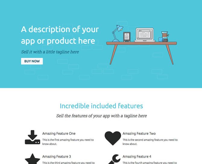
Tech App Theme Bundle

Join our Mailinglist

To get updates about new plugins/themes and more

Find us on Facebook

Our Premium Quality Guarantee.

We stand behind our products and if you find you aren't able to use anything you purchase from Mint Plugins as advertised, and after contacting our support desk we can't get it fixed-up for you within 30 days of your purchase, we will gladly give your money back.