 Phil
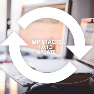
Phil We just released a big update for the MP Stacks Page-Building plugin. One of the best new features in Version 1.0.1.3 is the auto sizing of large text for small screens. Prior to this release, if you made a Text Content-Type in a Brick with a large font size, the words would get cut off on mobile screens.
Now, MP Stacks will automatically figure out the maximum size the text can be based on the longest word in your text area so that it fits perfectly on the Mobile screen without being cut-off or split up in any way.
This is all part of our philosophy to make it easy and fun for you to make fonts in a brick exactly how you’d like them on large screens, without needing to be bothered with options for smaller screens – but handling it perfectly all by itself. It’s small things like that that are often overlooked in mobile layouts – and is now one that MP Stacks handles perfectly. The update is available completely for free. Enjoy!