
 Phil
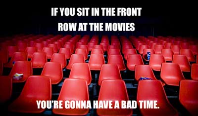
Phil I remember going to see “The Matrix” right when it came out. It was directly after my high school graduating ceremony and so we were running late. We finished up our graduation and raced over to the movie theatre. Unfortunately, you know what happens if you try to go to a movie late – you’re stuck in the very front row, off to the side, craning your neck from side to side of the screen just to see everything. It was pretty overwhelming and a bit nauseating – and I told myself that I would never come to a movie late again.
 What does this have to do with the content width on your website? Well, I have been seeing a trend in some websites where the content (text and images mainly) is wider than 1200 pixels in desktop view (we’re not talking about mobile phones here) – so wide, in fact, it touches all edges of the screen. I suspect this is because designers often have very large screens and so they design to make it look good on those screens – and let “responsive”-ness fix it up for any smaller screens.
Unfortunately, on my MacBookPro 15″, it means that the title of a section is scrolled out-of-view while I’m reading it’s subtext. This makes it very difficult for me to keep what I am looking at in context and I start to feel lost on the page – the same feeling I got at the movie theatre sitting in the very front row and off to the side.
Section titles are our “bearings” when we are reading a page – and as often as we can, it helps to keep those bearings in-view. Basically, a section of your page, (or “Brick” as we like to call it) should be able to entirely fit on an average laptop screen from top to bottom. (This is also one of the drawbacks of “responsive” web design – but that’s a topic for another blog).
By making our content extremely wide and large, it feels a little bit like going to the movies and sitting right in the front row. When you are designing your pages (maybe you’re using our free page building plugin “MP Stacks” to do so), make sure to test it on all screen sizes – and try to keep your page sections small enough that you don’t make your users feel like they are at the front row of the movie theatre.