Without good photography, any WordPress Theme will look bad.

without-great-photography-your-wordpress-theme-sucksIf you’re someone who’s purchased a WordPress theme before, you might relate to this experience: You see a theme that looks great in the demo before you purchase. However, once you install the theme, you realize that all of the great photography that you saw in the demo doesn’t come with the theme – and it’s looking pretty darn plain!

If you’re a photographer and you’ve got some great photos that match your website’s color-scheme and brand, you’re all set! However, if you’re not a photographer you might find yourself stuck at this point. You might feel “duped” by the theme seller – who made their “demo” look great by purchasing a lot of great Stock Photography – but they neglected to tell you that they’d spent over $1000 on Stock Photography to make their Theme’s demo look great.

We want to do things a bit differently, better.

When you purchase one of our themes, we have either taken the photos in-house or used 100% royalty free photos for all major design elements. Aside from some of our wordPress wedding themes (where you would assuredly want replace the photos of another couple with your own), we make sure that you have the license to use the photos in our “demos”, and that they are delivered with the theme when you purchase. Not only are they delivered, but they are uploaded DIRECTLY to the places they need to be on your website.

Great Photos Included, but still easy to swap.

Because all of our Theme Bundles are powered by MP Stacks (our page building WordPress Plugin), you can easily swap out any photo that comes with a Bundle. This is an extremely simple tool for those who have photos of their own that they want to use with the Theme. And so, while we make it super simple to change any photos, you also get great photography with all of our themes in-the-box.

Where to get some great photos for free:

If you’ve purchased a theme from another company and had this sinking feeling directly after purchasing – realizing that the photos aren’t included and the theme looks really “empty” now, there are a few things you could try. There are some great free photo websites out there that allow you to use their photos at no extra cost.  One of our favourites is UnSplash – https://unsplash.com/.

Our free GoogleMaps Add-On for MP Stacks just got easier!

We just released an update for our Free Google Maps Add-On for MP Stacks (Our Page Designing/Building Plugin for WordPress). Previous to this version (1.0.0.6), you had to enter a Google maps API Key – which was a nice feature for those who wanted tracking control – but in reality was never used by any of our users.

This unnecessary complication has now been removed from the Add-On plugin and it will work right out-of-the-box now without any additional ‘digital handshakes’ with Google needed.

If you already have this plugin installed in your WordPress, you can easily get this update by going to “Dashboard” > “Updates” and clicking the “Update” button.

Let us know if you have any questions about this update and we’ll be glad to answer them for you.

New update released for Slider

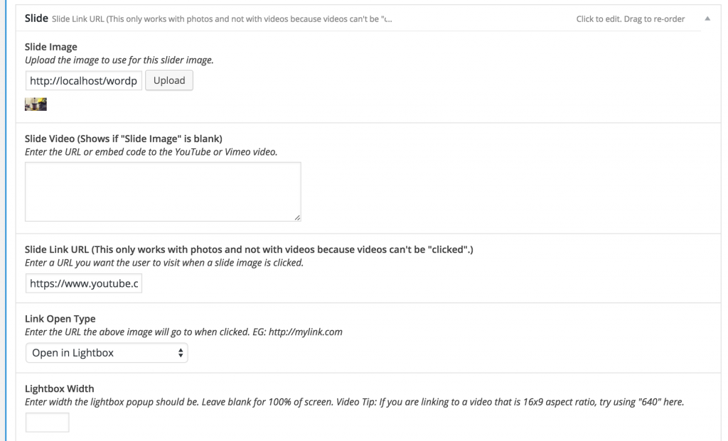
We just released a new update for our Slider Add-On Plugin for MP Stacks called “MP Stacks + Slider“. It now has the ability for any slide to link to any URL. It also has open-type controls which allow you to choose how you wish for the link to open. You can tell it to open in a new window/tab, in the same window, or even in a Lightbox Pop-up with a specific size. This is great if you want it to open a YouTube or Vimeo Video!

Here’s a screenshot of the new controls:

New Link Controls in MP Stacks + Slider.

New Link Controls in MP Stacks + Slider.

The story behind our new Church WordPress Theme

We have been creating WordPress content for almost 7 years now – initially through our Theme-Based website “Mint Themes” and now also through this website (Mint Plugins). We built quite a few WordPress Themes for Churches aimed at making it simple for a Church to get their website online. Thousands of churches have successfully built their websites with our Church Themes.

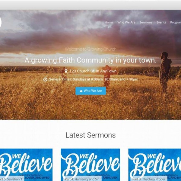
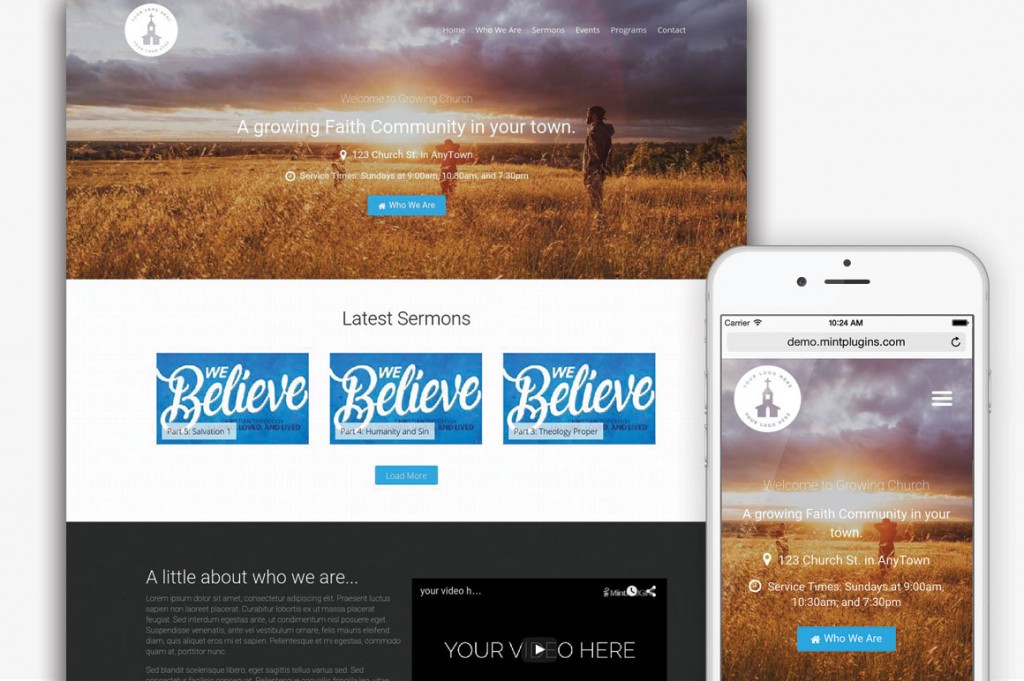
We just released our first new Church Theme in 2 years – with good reason for the long delay. We have done a ton of hours of coding to make sure it is the absolute best theme experience for both the site owner and the site user. We think you will truly love the experience of using it. If you’d like to check it out, head over to the “Growing Church Theme Bundle” page.

home-3

Old Weaknesses become New Strengths.

With any product, there are inherent weaknesses. The goal of a good Theme Creator is to learn from those weaknesses and make better products. For example, the Church Themes we’d previously built were designed prior to the mass-usage of “Smart Phones” and therefore, the need for responsive design. This made it so that, while we could make those Themes work on smaller, mobile-sized screens, they were never really as good as they could/should have been on mobile.

Also, some of the functionality of the Themes was not as portable as it could have been – simply because plugins for churches were not being built yet. What does that mean? Well, put simply, it means that if you changed your theme, your sermons, events, photos and videos went with it. If you wanted a new layout, the functionality was “tied” to the theme – and you’d have to manually re-create each sermon.

Our sermon manager was also very basic. This was good because it was easy to use. However it was also bad in that there was no way to “group” sermons together. Often sermons come in a “series” and having a way to do this became one of our most requested features.

Another highly-requested feature was the ability to have “Recurring” or “Repeating” events. Churches usually run week-to-week. They might have the same events every week at the same time and the same place. For example, Sunday morning services are usually always the same every week. Churches found that posting the Sunday service as an event became very repetitious and sent us requests to allow events to “recur” – thus only needing to be set up once.

The New Strengths:

Portability

This new theme bundle has been completely built form the ground up to use plugins for functionality. This way, if you decide to use a different theme at some point in the future, your sermons and events can go with it without any issues. This way, you aren’t ever “trapped” at all and are free to do whatever you wish with your website.

Responsivity

The Growing Church Theme Bundle is completely responsive – even though it allows for complete customizability. You are free to completely re-arrange the page with a few clicks – but it will always be responsive. This is something that has been programmed intuitionally and from-the-start. Because we built the layouts to work with our MP Stacks page building plugin, you get both responsive-ness and customizability. It will always look good on any device!

Sermon Manager

The new sermon manager is powered by the “Church Theme Content” plugin which is built by ChurchThemes.com. Because of this, if you use any of their themes, you can easily switch to this new theme – or vice versa. This is a part of our portability mentioned above. But we’ve gone a few steps further than that and made it compatible with MP Stacks as well – meaning you have total control over how those sermons get displayed in a grid. You can allow for filtering using Isotopes, change the number of Sermons per row, sizes, and more! It is something that took months for us to get right – and we feel like it is finally at a place where it will be really valuable to churches who post sermons often. We’ve gotten great feedback from churches who are loving the sermon manager system in the Growing Church Theme Bundle so we feel like we’re on the right track with it! To be honest, we’re really excited to see how it can transform your sermon-section to be really user friendly for your website’s users.

Recurring Events.

Adding recurring event functionality to our themes became a priority after getting so many requests from customers for it. However, it was also one of the most difficult things we’ve had to code. Because time is infinite, it was difficult to decipher how to make events repeat forever without crashing computers. Eventually, after a few months of coding and testing, we came up with a solution that allows events to recur forever without slowing down the system at all.

We added this recurring functionality to our events plugin and also to our MP Stacks + EventGrid plugin – which is what powers the event grid in the theme. Again, because this functionality is in a plugin and not tied to the theme, it allows your events to be “portable” and used with any other theme in the future.

New Font-Weight Controls in our free MP Stacks Google Fonts Add-On

This week we released an update for almost every single one of our plugins – and the Google Fonts add-on for MP Stacks had a particular addition which has already proven very useful to our users – so much we’ve received some “support requests” just to say “thanks” – which is really cool for us!

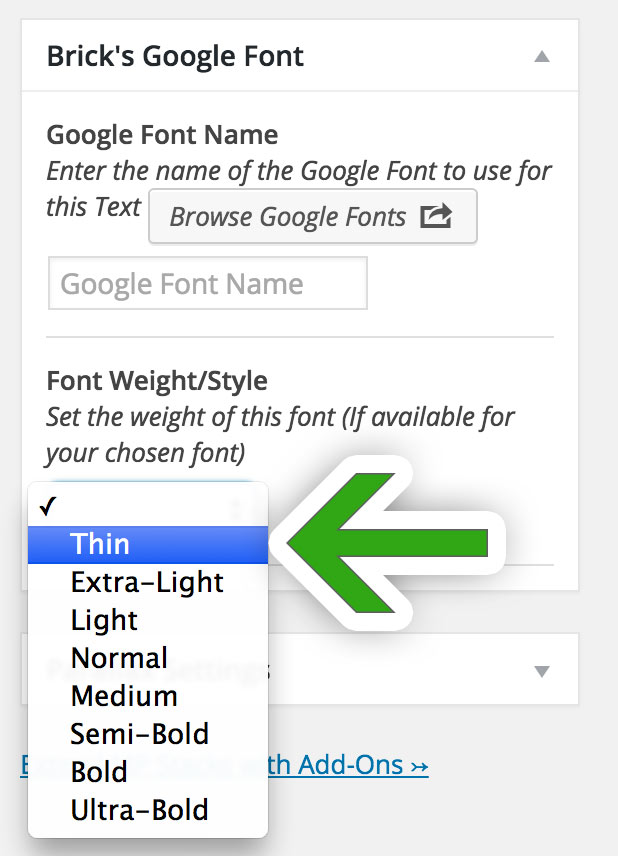
The new addition is Font Weight controls. In this update (Version 1.0.0.6) , if a font on Google has different weights available, you can simply select the weight you’d like to use for any text area! It’s super simple!

You can get the Google Fonts Add-On for MP Stacks totally free! Download it here.


googlefonts-weight-selector

New Multi-Device Text Size Controls in MP Stacks

We released version 1.0.2.9 of MP Stacks this week and one of its main new features is the ability to control text sizes, colors, line-height, and spacing separately on differently devices.

office-583839_1280

device-size-text-controls-mp-stacks

Why have separate controls for different devices?

Sometimes, you might want EXTREMELY LARGE font sizes for your main tagline on your home page. While it might look great on a desktop-sized computer, that same LARGE font size takes up too much space on a phone! With separate font-size control for each device, you can now make it look EXACTLY how it should for each separate device!

Sometimes you’ll want to put text overtop of an image. This is great if the whole image is dark and your text is light in color (or vice versa). But if parts of your image are lighter than others, the text can get washed-out and disappear against the background. This might ONLY happen on a phone-size screen, or an iPad sized screen. With these new controls, you can change the color on the Phone size so that your text always “pops” no matter the screen size.

We made sure to keep these controls simple to use and they only display for the device you need. Simply click on the device you wish to set and change them.

If you have any comments or questions about these new features be sure to let us know in the comments or by emailing us at support@mintplugins.com.

“The WordPress Customizer” vs “MP Stacks Brick Editor”

We are big fans of the WordPress Customizer and have built all of our Themes’ basic controls to use the Customizer. However, while there are certain simple things that work great in the Customizer, other things don’t work quite as well with it. When it comes to building products that our customers will love, we want to use the right tool for the right job. We’ve discovered that the Customizer isn’t the right tool for EVERY job.

Goal for this post:

There are many posts on the internet describing the WordPress Customizer’s strengths and they are all great! However, this post is simply an honest look at a few of the key weaknesses it has as well. For this investigation we’ll be going over a few key points, how they are weaknesses, why we’ve decided not to use it in MP Stacks, and have instead decided to move forward with our custom “Brick Editor” for the foreseeable future. This is not intended to “bash” the WordPress Customizer in any way. Rather, it is meant to honestly outline some of the weaknesses it has and reasons for other types of solutions to live alongside it.

Weaknesses in the WordPress Customizer:

  • Control Context: It can be hard to understand which options control which parts of the page or site.
  • Control Area Size: Some controls need more space than the Customizer Allows for.
  • Structure Consistency: The customizer wasn’t built for any specific page structure.

1. Control Context

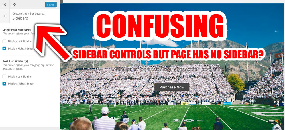
customizer-wp-context-confusion
Control Context is something that all three of the issues in this post are related to. When you first load up the WordPress Customizer, it shows you the controls for your entire website. Some controls are even for pages that aren’t in-view at the moment. This becomes extremely inefficient if you wish to have many controls in an extremely flexible page design. Suddenly, the user is faced with hundreds and hundreds of options and the context of those options is completely lost. They don’t know if a certain setting affects their current page, or a completely different, currently hidden part of the site. Even the slide-style controls recently added to the customizer to help de-clutter don’t help to keep context – in fact they have the opposite effect. If you’re anything like, you might take a break for 5 minutes and come back – only to forget which section of settings you had open – and no way of knowing without clicking back through all the different settings screens in the Customizer.

How the MP Stacks Brick Editor does this better:

brick-editor-context-in-tactRather than showing ALL of the controls for the entire website at once, the MP Stacks Brick Editor ONLY shows the controls for the Brick (or page section) in-question. By double-clicking on any Brick, it opens ONLY the options for available that section of the page.  This way, the user knows that any change they make will only affect that page section (or “Brick”). This keeps things much simpler – and actually allows for much more control at the same time. You could have thousands and thousands of settings – but the user won’t get overwhelmed because they only see what they need to – when they want to.

2. Size:

The WordPress Customizer takes up a very small portion of the left-side of the page. The reason for this is because of its live-preview nature. When you make a change in the customizer, it automatically refreshes on the right side so you can see the change you made in-action. While this is a great feature, it also has its drawbacks. The small size available to the Customizer contributes to the “Control Context” issue above because once you start to have many many options, squishing them into the side starts to get more frustrating – as you need to scroll for a long time to view each available option.

How the MP Stacks Brick Editor does this better:

Some related-controls work best to be beside each other horizontally. For example, in MP Stacks when using the “Text” Content-Type, you have the ability to set, across different device sizes, the Font Size, Line Height, Paragraph Spacing, and Google Font for each text block. Each of those options sit beside each other horizontally and take up much less vertical space – thus removing the need to scroll.

side-by-side-related-controls

3. Structure Consistency:

Using the WordPress Customizer can have a bit of a “Where’s Waldo” feel to it at times. You might make a change to a setting and have to keep your eyes glued to the right side to see if you can find where the change has been made – whether you need to scroll to see it – or if it is even on another page. This issue is similar to the Control Context issue as well. One of the reasons it has this problem is because it wasn’t built for any specific type of page structure. While this is good for expandability, it is also a restriction in that it can’t be as neatly organized as a Control Area built for a specific page structure.

How MP Stacks Brick Editor does this better:

When building our Brick Editor in MP Stacks, we thought about Page Structures from the very beginning. All pages built with MP Stacks have the same basic structure: A Stack which contains an unlimited number of Bricks. This structure allows for a much more speedy page-building process – similar to how a paved freeway allows you to go much quicker than a dune-buggy across sand. Sometimes a little bit of structure actually creates space for some more freedoms.

The controls in the Brick Editor are built to be consistent for every single Brick. Each Brick has Background Controls and Foreground Controls – with a neat and organized place for each. Once the user learns this layout for Controls, they know how to change anything on any part of the site. This is in direct contrast to the Customizer, which doesn’t have any real relation to the page structure whatsoever – and while more “free” like a sand-dune buggy, it’s also more random, requires more guess work, has a longer learning process, requires you to store more in memory for future usage, and doesn’t have the freedom of speed that a paved freeway gives you.

Conclusion

All in all, we feel the built-in WordPress Customizer is great for simple things that appear on every page like your Site Logo, Header Content and Footer Content. However, for more complex page elements that require many settings, the Customizer doesn’t provide an easily navigable experience – which we feel our Brick Editor in MP Stacks does a much better job at.


SocialGrid Updated to Version 1.0.0.7

We just updated our MP Stacks + SocialGrid Add-On to version 1.0.0.7. This update moved the YouTube Comments from Google “Old” way of fetching the comments to their “new” way – also known as Version 3 of their API (for the techies in the room).

YouTube comments will be broken if you have an old version because of this so update as soon as you can by logging into your WordPress dashboard and clicking on “Dashboard” > “Updates”. You can do the update directly there.

Let us know if you have any trouble getting the update by emailing us at support@mintplugins.com and we’ll be glad to help you out!

WordPress 4.3 is available!

WordPress just released version 4.3. You can easily update by logging into your WordPress and clicking on “Updates” under the “Dashboard” tab on the top left side of your dashboard screen. We’re happy to say that all of our plugins and themes are fully compatible with this update – just make sure all of your plugins and themes get updates when you do the WordPress update as well.

One of the main features in the new version of WordPress is the “Favicon” That’s the little icon that appears in your browser tabs. You can easily upload your favicon (or “Site Icon” as WordPress is calling it) by going to “Appearance” > “Customize ” > “Site Identity”. Additionally, changing your “menu” is done in the “Customizer” as well now. There has been some controversy about whether this is the best way of changing menus in WordPress – but for now, that’s the new way of doing it. (Previously this was done by going to your dashboard and then “Appearance” > “Menus”).

A lot of users wonder why updates need to happen so often – and whether or not they should be doing them. The short answer is that you should always do your updates because they help to keep your website secure – as hackers are always inventing new ways of “getting in”, and WordPress is constantly beating them 🙂 If you don’t do the update, you could be exposing your site to those hackers.

Sometimes, with “big” updates like the one WordPress just released, you may want to wait a couple of days before updating to make sure that any “bugs” get worked out and found by the “more brave” website owners among us – but don’t wait too much longer than a couple of days or you risk exposing your website.

Another thing you need to make sure of is that all of your plugins stay up to date as well. Sometimes, if updating plugins/WordPress/themes has broken your website in the past, you might be wary of doing it again. But even still, you should do your best to make sure you keep everything up to date. If an update “breaks” your website, contact the author of that plugin immediately to let them know. Most good plugin authors will respond very quickly – and if they don’t respond at all, it’s likely best to stop using that plugin because the author isn’t actively supporting it.

If you are particularly web-savvy, having a “staging” version of your website set up is a good idea to test updates before they come out. A staging site is basically an exact duplicate of your website that exists purely for testing updates and changes. If your website is growing or has a lot of users and you can’t afford to be down for even a few hours, it’s a good idea to look at setting up a staging version of your website.

If you have any questions or comments about updates, let us know in the comments below – or drop us a line by emailing support@mintplugins.com. We’ll get back to you very quickly – as helping our customers is one of our favourite things to do!

Give your site a fighting chance with Analytics

I’m always shocked when people tell me they don’t have Google Analytics tracking on their website. Speaking from experience, it is really important to know why people are coming to your website. Analytics help you “steer” your business in the right direction. Many websites start with a goal to do “Thing A”, struggle for a year, and then find they are actually getting traffic to their website for “Thing B” – which might have even just been a single blog post about a random/different topic.

[bctt tweet=”Knowing why people are visiting your website allows you to adapt – and it is essential to your online success.”]

Once you find out that 99% of people are coming to your website for 1 single blog post (as I did with one of my websites), you’ll realize that blogging about that particular topic is probably a good idea. You’ve probably just found your “niche” – and you might have missed it all together without setting up some simple analytics tracking.

Step 1 is to sign up for Google Analytics: http://www.google.com/analytics/

Step 2 is to install a Google Analytics plugin on your website. I recommend the free “Google Analyticator” plugin here:
https://wordpress.org/plugins/google-analyticator/

This way you know exactly why people are coming to your website and your chances of online success will grow by leaps and bounds!

*If you notice that you are getting a lot of weird websites listed in your Analytics as “referrers”, read our next post about eliminating pesky Analytics Spammers here.


How to eliminate pesky Analytics Spammers

Note: Our “Master List” of Spam websites-to-block is at the bottom of this post.

If you’ve set up Google Analytics on your website, you might have noticed some weird websites being listed as “referrers”. There’s a new, pretty annoying spammer trick out there now where the spammer will send fake “visits” to your website from their own website. This makes their website “rise the ranks” on your analytics list of referrers, and it makes you – the site owner – go and check out there website. Pretty sneaky huh?

That’s only half of the annoying part. The main problem is that now you don’t actually know who is linking to you! This can be a major problem – but there is a pretty simple way to fix it. You can tell Google Analytics to “block” referrals from specific websites and it really easy to do.

Step 1:

Go go https://google.com/analytics/web/ and log in.

Step 2:

Make sure you are on the “Admin” tab at the top of the page.

admin-tab-google-analytics

Step 3:

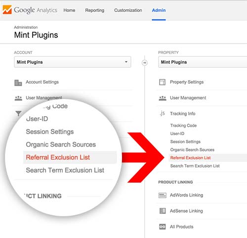
In the middle “properties” column, click on “Tracking Info” > “Referral Exclusion List”.

referral-exclusion-list

Step 5:

Click the “+ ADD REFERRAL EXCLUSION” button and type in all the domains that you want to block.

Tip: When you are entering a domain to block, you can adda “star” or “asterisk” (*) before the domain to also block any subdomains from that site. For example: site35.website.com, site36.website.com etc. (Website spammers are actually doing this and it could take you a long time to enter each subdomain individually – so this will save some time).

The “Master Spammer List”:

Because there are so many of these spammers popping up, we are going to keep a master list of all the spammy websites here so you can easily add the entire list to your website – instead of fighting with each one for months – only to find another has popped up. If you find a spammer domain on your website’s analytics that isn’t on this list – please let us know in the comments below and we’ll make sure to add it. This way we can all work together to eliminate every last one of these annoying spammers and get back to working on our websites!

Block These Sites:

  • semalt.com
  • *.semalt.com
  • simple-share-buttons.com
  • *.simple-share-buttons.com
  • aliexpress.com
  • *.aliexpress.com
  • googlsucks.com
  • *.googlsucks.com
  • buttons-for-your-website.com
  • *.buttons-for-your-website.com
  • theguardlan.com
  • *.theguardlan.com
  • myftpupload.com
  • *.myftpupload.com
  • best-seo-offer.com
  • *.best-seo-offer.com
  • 4webmasters.org
  • *.4webmasters.org
  • social-buttons.com
  • *.social-buttons.com
  • hulfingtonpost.com
  • *.hulfingtonpost.com
  • hol.es
  • *hol.es
  • Get-Free-Traffic-Now.com
  • *.Get-Free-Traffic-Now.com
  • buy-cheap-online.info
  • *.buy-cheap-online.info
  • free-share-buttons.com
  • *.free-share-buttons.com

Blocking the bots (advanced)

Ideally, we’d prevent these bots from accessing our site AT ALL as they are draining resources needlessly. There are ways to block them entirely using htaccess (if you use apache) and in your sites-available file (if you use nginx). I won’t get into that in this blog post – but there are a lot of great resources out there for blocking evil bots altogether.

Here’s a link for Apache (htaccess): http://www.marketingpilgrim.com/2014/08/tips-for-blocking-semalt-and-botnet-attacks.html

Here’s a link for NGINX: http://www.mkyong.com/nginx/nginx-block-referrer-spam/

Because I use NGINX for all my web servers I will add my code for how I block these spammers from my server altogether. In the “nginx/sites-available/mywebsite.com” file, under “location / {” I add the following if statement which blocks most spammers:

if ($http_referer ~* (seo|babes|click|girl|jewelry|love|organic|poker|porn|sex|teen|video|webcam|semalt|simple-share-buttons|aliexpress.com|googlsucks|buttons-for-your-website|theguardlan|myftpupload|4webmasters|social-buttons|hulfingtonpost|hol.es|free-share-buttons.com|www.Get-Free-Traffic-Now.com) ) {
return 405;
}

Have more sites to add to this list? Help everyone out and let us know in the comments below.

How to trade a song (or file) for an email address!

how-to-trade-an-email-for-a-songGetting people to sign up for your mailing list is imperative to your online growth – whether you are a musician, artist, or business. Social Media accounts like Twitter, Instagram, and Facebook are also very important. But don’t overlook the incredible value that an email list can have – especially when the people on your email list WANT to get emails from you.

In this post, I’m going to show you a quick and easy way to set up an email sign-up form (using MailChimp.com) which will trade a file download (song, zip file, video, or even just a URL to a secret video) for a user joining your email list.

We’re also going to use the “Double Opt-In” feature with MailChimp so we KNOW that people really want to hear from us – and then we don’t have to feel like spammers when we send out emails 🙂

Following these steps should take you about an hour:

Step 1.

Get a free MailChimp account by signing up at https://mailchimp.com

Step 2.

Buy our MP Stacks + Mailchimp plugin for $5 here. Once you’ve purchased the plugin, download it and then install it on your WordPress on the “Plugins” > “Add New” > “Upload” page in your Dashboard.

Step 3.

Choose the page you want to place the email sign-up on. Maybe this is your home page, or maybe your footer. Edit that page by going to “Pages” in your WordPress Dashboard.

Step 4.

Make a new Stack by clicking on the “Add Stack” button above the text area on the page editor. The button looks like this:

add-stack-button

If you’ve already added a Stack to your page you can, of course, skip step 4.

Step 5.

Once you’ve added a new Stack to the page, view the page by clicking “View Page” at the top of your screen.
Stack-on-page

Step 6.

For new Stacks click “Add a Brick to this Stack”. It will look like this:

blank-stack

If you have already created Bricks in this Stack, open the Brick Editor by clicking “Edit Brick.

Step 7.

In the Brick Editor, which is now open on your screen, under “First Content-Type”, choose “MailChimp”.

Step 8.

You will now see some options for your MailChimp information. Click “Find Your MailChimp API Key Hereto quickly locate your API Key (Make sure you are logged into MailChimp). Then paste the key into the Brick Editor.

Step 9.

Create a “List” in MailChimp. You can do this by going to MailChimp and logging in. Then at the top click on “Lists” > “Create List”. Call the list something like “Song/File Name X Download”. You want the name of this list to correspond with the action the user is taking so they understand.

Step 10.

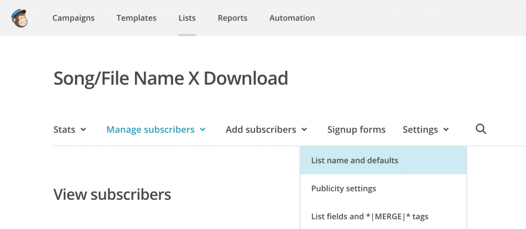
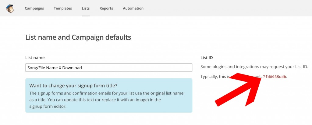
Locate the list ID. The list ID is easy to locate. Go to “Lists” > Select your list > “Settings” > “List Name and Defaults”. It looks like this:
Mailchimp-list-id

List-id-mailchimp

Step 11.

Copy the List ID and paste it into the Brick Editor. You can also start to design the Brick the way you’d like by adding a Background Image/Color under the “Background Settings” on the top right. When you are ready, click “Update/Publish” on the very top right side of the Brick Editor.

Step 12.

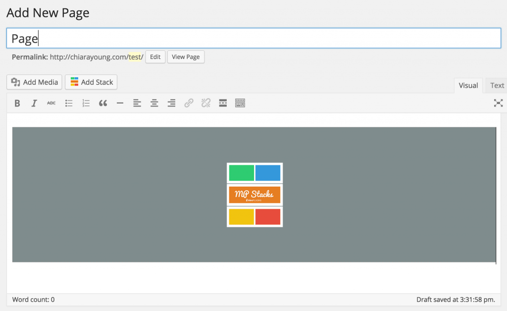
Create a new Page in WordPress by going to “Pages” > “Add New”. This page will be a “secret” page that your new subscribers will be automatically sent to when they sign up. It is on this page where we’ll “give” them the Song/File. Call the page something like “Thanks for Subscribing!”. You can then click the “Add Stack” button to place a new Stack on this Page.

Step 13.

View the page you created in Step 12 by clicking the “View Page” button at the top of the page and then Add a new Brick to the Stack. In this brick, under “Content-Type 1”, we’ll choose “Text”. In the text area we’ll write something like “Thanks for Subscribing. Here’s is your file download”. Then, we’ll click “Add Another” at the bottom of the text area to add another Text Area. In that area, we’ll upload the file we want to give the user and insert it into the text area using the “Add Media” button just above the text area. When we’re done all that, click the “Update button at the top right of the Brick Editor.

Here’s a sample of the “Thanks for Subscribing” page I made in 2 minutes with MP Stacks:

Here's a sample of the "Thanks for Subscribing" page I made in 2 minutes with MP Stacks

Step 14.

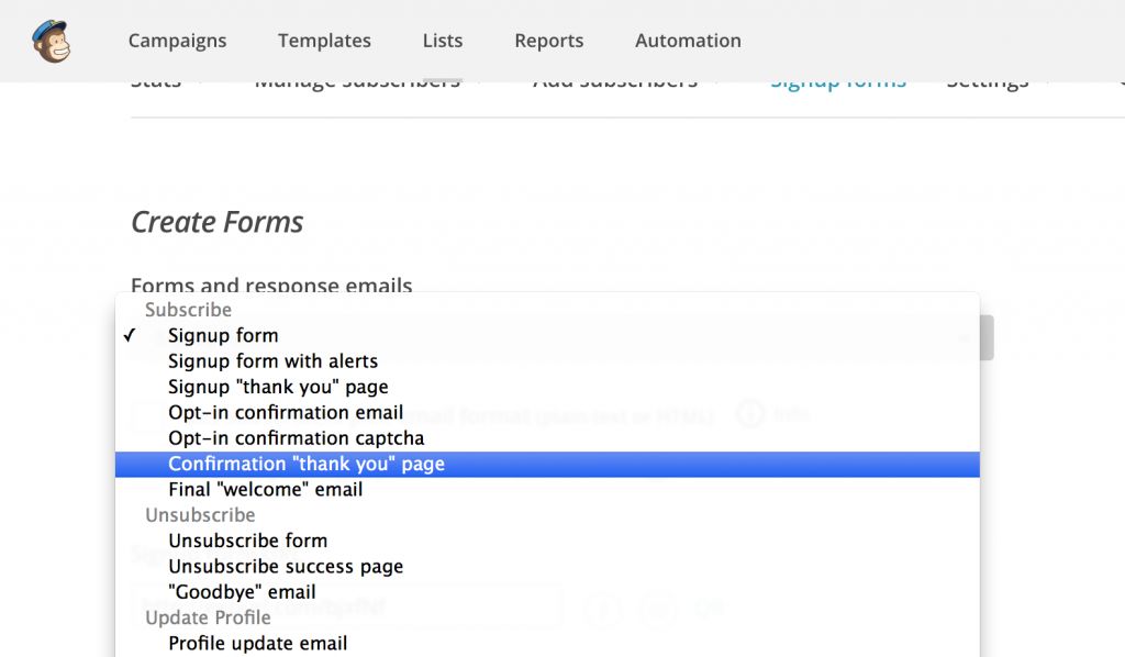
Now we have the “Secret” page which will deliver the file to the new subscribers – but how do the new subscribers get here? It’s pretty simple. Go back to your MailChimp dashboard and select the List we have been using by clicking on “Lists” at the top of the page and then selecting our list. Now, click on “Signup Forms” > “General Forms”. Find the form called “Confirmation ‘Thank You’ Page”. It looks like this:
Mail-chimp-edit-confirmationpage

Once we click on that, you’ll see an option that says: “Instead of showing this thank you page, send subscribers to another URL”. In that field, copy/paste the URL of the page we created in Step 12.

Step 15 (Optional & Advanced).

At this point everything is done and working! Congratulations on a job well done.

Now, if you are slightly more advanced and want to block Google from “indexing” your secret page (from Step 12), open your FTP and go to your WordPress’s root directory (the place where the wp-content, wp-admin, and wp-includes directories sit). In here we need to create/modify the “robots.txt” file to tell Google (and other search engines) that we don’t want our secret page to be indexed. If the “robots.txt file exists there, open it for editing. If it doesn’t exist, make a new file and call it “robots.txt” and open it.

Now locate the “slug” of your secret page by going to “Pages” > your secret page. The slug is located just beneath the Page Title field and looks like this:

page-slug-wordpress

In that robots.txt file we need to add this line:

Disallow: /thanks-for-subscribing/

Then save that file in your WordPress root directory and Google won’t index our secret page.


And there you have it! This has been a great way for both myself, customers, and friends to grow their email lists.
 

Why You Still Need A Website in 2015

really-need-a-website-in-2015With the advent of social media (almost 10 years ago now), websites have become a little bit of an afterthought – after making sure to keep your Facebook, Twitter, Instagram, Snapchat and other social media profiles updated. And without a doubt, this is great practice. But, websites are just as important in 2015 as they ever have been – if not more-so. Here are a few reasons why:
Reason 1: Professionalism.

While having active social media accounts is an awesome online strategy for getting your business “out there”, having a great-looking and functional website behind it all really makes your brand stand out as being professional, “here to stay”, and not just interested in the latest fads and trends.

Reason 2: Consistency.

Your website is a place where information about your company lives – and can be quickly accessed by anyone looking to learn about who you are. Too often, business and brands rely on a single paragraph in an “about us” section on Facebook – leaving new customers scratching their heads about what exactly it is that you do. If all you have are Facebook status updates, new customers looking to learn about you will have to scroll through months of status updates just to get a feel for your company/brand. A well polished website is a much stronger way to leave a lasting impact in their minds – while directing them to your social media FROM your website is a great way to keep them engaged day to day.

Reason 3: Control for the long run.

This might be the most important reason of all. If a social media site decides to change up its business model, they could delete your content, or even remove your entire profile if they so choose – if you were seen as a competitor or as breaching their terms in some way. At the end of the day, they own the content on their website – just like you own the content on your own. So while generating Facebook likes, Instagram Followers, and Twitter Followers is great – it shouldn’t keep you from building your own user base through your website as well- via something like an email list or even allowing them to become members of your own website (WordPress has this capability built-in). This way, you can guarantee that your own brand won’t get wiped-out with the next change to Facebook’s algorithm or Instagram’s new privacy terms and conditions. I know many bands who built huge followings on MySpace (if you can remember back that far) – only to lose that following when the website died out. Had they been promoting their website alongside their social media the whole time, they wouldn’t have taken as hard of a hit when change came. And if there’s one thing we know to be true about the internet, it’s that it is constantly changing. Will Facebook die out soon? It’s unlikely, but having a strong website presence is a great way to ensure you remain captain of your online ship.
Again, none of these reasons should prevent you from using Social Media and posting often! Social Media is a really powerful tool to generate interest in your company/brand. But having a website to go along with it gives you something solid to link to from Social Media – and puts the control back into your hands – allowing you to craft content that fits YOU – rather than just content that fits a social media website. It’s your way of telling people that you’re in this thing for the long haul – not just another “here today, gone tomorrow” company.
There are a ton more reasons why having your own website is still important today – like e-commerce and being able to control your own online store. Do you have something to add? Let us know in the comments! We love reading your ideas.

Backup your Customizer with a click!

Our newest free WordPress plugin lets you backup your WordPress customizer with a single click! You can even download your backups so you can take them with you to other websites or back them up safely on your own hardrive 🙂


MP-Customizer-Backups

Why backup the Customizer?

The main reason to backup your customizer is because it can be fun to play with the customizer to try out new page designs and colour schemes. But what if you make a mistake and want to quickly revert to a previous setting? Now it’s super easy to do.

You can also develop locally – or on a “staging” website, export the backup, and then import it on your live site. This is a super simple and quick way to move your customizer settings from one website to another.

Check it out here:
https://wordpress.org/plugins/mp-customizer-backups/

Moving from Weebly to WordPress

I talk to a lot of people who have built their websites on services like Weebly.com and have outgrown the possibilities with the website system there. Don’t get me wrong – weebly.com is a great starting point for your website – but chances are, if you are serious about growing your website, you will quickly outgrow the limitations that website services like Weebly put on your website.

It is at the point where someone’s website starts growing that they start looking into WordPress – because of it’s amazingly huge extendability. With the use of plugins, your website’s potential increases thousands-fold. You can now install things like SocialGrids which pull all of your latest feeds from Social Media, put Email sign-ups anywhere on your website, use great services like Optin Monster to grow your mailing list, and TONS of other things I could rant on-and-on about but won’t for the purpose of keeping this blog short.

Bottom line: WordPress increases your website potential by leaps and bounds over a service like Weebly.com

Today I was helping a music artist move from weebly.com to bluehost.com so they could set up a WordPress-based website. There is one major “gotcha” that I want to point out to people moving from weebly to help prevent them from making a mistake I just made – causing the artist’s email to go down for over 6 hours – and put me on the phone for almost all 6 of those hours.

TIP: Update your email before you move the domain.

If you use Weebly, chances are you use Google Apps for your email service. Unfortunately, Weebly seems to wipe your email settings from the domain (MX Records for the geeks out there) before transferring the domain. Because domain transfers can take up to 7 days to fully go through – YOU COULD BE WITHOUT EMAIL FOR 7 DAYS! Fortunately in this case it was only 6 hours – but it’s still a stressful period when important emails are being missed.

When you log into Weebly to unlock your domain so it can be moved, make sure to set your MX records manually BEFORE you initiate the transfer. You do that by doing the following:

  1. Log into weebly.com
  2. Click on “Domain” from the top navigation
  3. Click the “Manage” button the right hand side beside your domain
  4. Click on the “DNS and Name Servers” tab
  5. Under “MX Records (email)” click “Edit”.
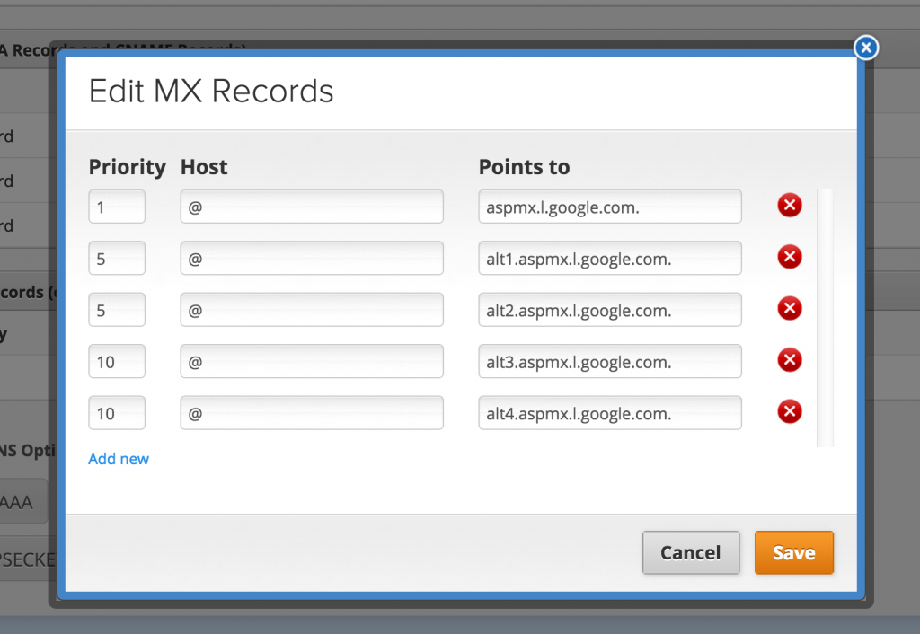
  6. Add in your MX Records so they look like this (using Google Apps information)

Screen Shot 2015-04-08 at 1.26.07 PM

This will help to prevent you from losing your email during the transition period as your emails will continue to be routed properly. I hope this helps to reduce some of the stress for you if you are moving your domain from one service to another.

For moving your data (text and images etc) from Weebly, we recommend that you back them up into a text file and onto your hardrive. Weebly’s migration systems aren’t very well executed and with a manual backup of all your text and images, you can be sure you won’t lose anything. Then, you can re-enter it all into WordPress once you have it set up on your new webhost.

We <3 WordPress

We love seeing people using WordPress because it is truly the best system out there for Websites today. If you need a recommendation for a webhost and you are a small company, I would recommend BlueHost, Host Gator, or Dreamhost. (Note: these are not a sponsored links and we aren’t affiliated with any of these companies so we can’t guarantee a great experience all the time – this is merely pointing in a decent hosting direction). If you are a growing company and looking for a good webhost, I highly recommend looking into Digital Ocean – both for the price and the amazing, rock solid servers. We are hosting this website on Digital Ocean’s servers and it has been great. However, there is a bit of a learning curve so I only recommend it if you have some server experience.

Our Latest Theme Bundle

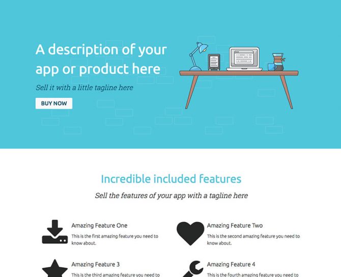
Tech App Theme Bundle

Join our Mailinglist

To get updates about new plugins/themes and more

Find us on Facebook

Our Premium Quality Guarantee.

We stand behind our products and if you find you aren't able to use anything you purchase from Mint Plugins as advertised, and after contacting our support desk we can't get it fixed-up for you within 30 days of your purchase, we will gladly give your money back.