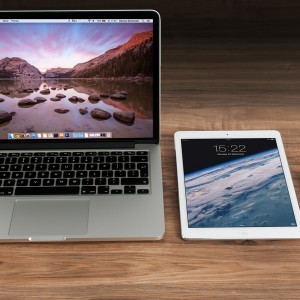
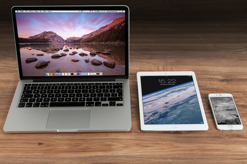
We released version 1.0.2.9 of MP Stacks this week and one of its main new features is the ability to control text sizes, colors, line-height, and spacing separately on differently devices.
Why have separate controls for different devices?
Sometimes, you might want EXTREMELY LARGE font sizes for your main tagline on your home page. While it might look great on a desktop-sized computer, that same LARGE font size takes up too much space on a phone! With separate font-size control for each device, you can now make it look EXACTLY how it should for each separate device!
Sometimes you’ll want to put text overtop of an image. This is great if the whole image is dark and your text is light in color (or vice versa). But if parts of your image are lighter than others, the text can get washed-out and disappear against the background. This might ONLY happen on a phone-size screen, or an iPad sized screen. With these new controls, you can change the color on the Phone size so that your text always “pops” no matter the screen size.
We made sure to keep these controls simple to use and they only display for the device you need. Simply click on the device you wish to set and change them.
If you have any comments or questions about these new features be sure to let us know in the comments or by emailing us at support@mintplugins.com.


